Indecision
Sometimes I get two shots of something and find myself torn between the two choices. I like them each for different reasons and yet can’t say one is better than the other. knows what I mean. Now, below you’ll find two images, almost identical. I like the one on the left because of the extra green on the right. I like the one on the right because the shadows are different. How to choose?? That’s where you come in. Tell me which you like better. The person who writes the most compelling comment about which photo is better will receive a digital download of the image. (For a look at the larger version of each, please check out 102 [pictured to the right in image below] and 103 [being on the left in photo below] on Flickr)
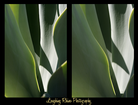
Oh, and by the way, my inspiration: I saw in this plant the green equivalent of an Antelope Valley slot canyon, if that makes any sense. (Just nod and pat me on the head. I’ll shut up eventually.)
Well, I like that shot for the same reason… but the bottom left tiny cut out portion irritates me. LOL!
I like the other shot. The green seems almost alive, undulating; it’s the true focus of the image.
KWIM?
Comment by pam — 2009/02/03 @ 08:20
That’s the only part that bugs me, too, Pam. Weird how that happens. But I could always ‘shop the corner in.
Comment by DaGoddess — 2009/02/03 @ 08:33
I like the one on the left, hands down. It has more depth, and I prefer the sharper lines and crisper image. I also like the texture which is more visible on the white/illuminated leaf. I also prefer the composure of the left image. It has a stronger draw for me, it pulls me into the photo more than the one on the right. I can’t really explain it in a photographer’s terms. The one on the left feels like a peaceful, quiet nighttime shot, and the one on the right has an early morning sunrise not enough sleep qind of feel :thumbs:
Comment by Stu — 2009/02/03 @ 08:42
Left, absolutely. Negative space is balanced, exposure and focus are both much better.
:rain:
Comment by jan — 2009/02/03 @ 20:24
Left. Like Stu I prefer the crispness of it. The right has more out of focus parts. In a bad way.
Comment by caltechgirl — 2009/02/03 @ 21:39
103a is my preference. But I wish no one had pointed out the lower-left corner. I know that we merely ran out of plant there, but still ….
Comment by Lloyd — 2009/02/03 @ 22:46
That corner will be fixed. That’s the nice thing about post-processing: I get to play God and change subjects as I want. :biggrin:
Comment by DaGoddess — 2009/02/04 @ 00:48
Well, since you were all kind enough to chime in, you all get a copy of #103.
Comment by DaGoddess — 2009/02/09 @ 12:57