Back to Alaska
In Denali Park, to be exact.
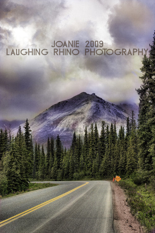
I’ve had some feedback already that sugggests I take out the sign. I can see where they’re coming from, but I keep thinking of that as a little mental marker about all the construction on the road and how that was part of the trip. HOWEVER, if I were to stop viewing this image as a trip reminder and an actual landscape photograph, the sign should definitely go.
What do you think?
Filed under: Photography ~ Comments (15)
Lose the sign, add a bear!
Comment by The Gray Monk — 2009/07/25 @ 04:57
What’s with the weird colors? A bear would be a great addition. Or a moose crossing the road. And maybe an eagle soaring overhead…
Comment by Jan — 2009/07/25 @ 07:17
The photo is magnificent, but without the road litter? Awesome! I vote to chuck the sign. Kick it to the curb. Heh…
Really wonderful capture! :worship:
Comment by Pam — 2009/07/25 @ 07:29
Add a bigfoot directing traffic. :box:
Comment by JihadGene — 2009/07/25 @ 10:07
I actually like the sign in there. It sort of like a dose of reality or a reminder that we are treading on these magnificent landscapes. It gives another perspective and an object of interest to ponder. I think it really adds to the photo.
Comment by DogsDontPurr — 2009/07/25 @ 11:20
I don’t remember the colors like that, but then, I see this damn near everyday. leave the sign. it’s a humorous reference to the bump in the background. If you don’t know that the road doesn’t go as far as that knoll, you can take it as an advisement…. but then I see humor in everything. (except subarus)
Comment by p2 — 2009/07/25 @ 12:45
A photo without the sign – well you would call it a photo illustration then.
You know I’m a purist on what the camera sees. If you change it beyond basic color correction that the camera introduces, then it’s no longer a photograph. It’s a treated photograph ,a photo illustration.
It’s a lie.
Comment by Temple Stark — 2009/07/25 @ 13:22
I’m with who like the sign left in due to the humorous comment it makes.
I wouldn’t say it as strongly as ‘Temple Stark,’ but I understand the idea of wanting a photo to show what was there.
Cropping a photo may be a different way to eliminate the human presence, but it’s not false to what was there.
Comment by Lloyd — 2009/07/25 @ 15:10
I kind of like what Temple Stark had to say. There are so many different types of photography, and that’s what makes it an art. I’m one of the types that likes to just point and shoot and see what the camera comes up with. I love Polaroids. I love taking pictures with tiny little point and shoots that cost about 5 bucks.
But I appreciate those like Ansel Adams that would go to a location and wait all day or more for the light to be just right.
And I find it fascinating an image can be photoshopped and tweaked until it is something else all together.
But I think it all eventually comes down to the eye. Some people can see things in just the right way, know how to frame it. It doesn’t matter so much if it’s point and shoot, or photoshopped to the nines…..If you don’t have the eye, you’ve got nothing.
Joanie….you’ve got the eye!
Comment by DogsDontPurr — 2009/07/25 @ 22:58
Oh the only thing truly massaged is the color of the sky, but it’s how it would have looked if the camera had a chance to capture the depth and the feeling.
As for the sign, I guess it is what it is. Then again, I’m feeling somewhat reflective at the moment and I can’t be trusted to say or do anything that isn’t tinged with a bit of melancholy and hindsight. (Reunions do that to you)
I dunno. Maybe I’ll revisit when there’s less alcohol in my system and less emotion clouding my memory of everything. Sigh.
Comment by DaGoddess — 2009/07/26 @ 01:00
i like the sign. nice contrast. it could be bear instead… but i think you need something there for perspective.
Comment by mlah — 2009/07/26 @ 21:33
Thank you! Perspective. It does give some of that, doesn’t it? I couldn’t think of it.
Comment by DaGoddess — 2009/07/26 @ 21:42
I Love BUMP signs. Don’t know why, they just crack me up.
In Ireland instead of BUMP signs they have “ramp” signs. Those crack me up to as here in Appalachia a ramp is a sort of very smelly wild onion :biggrin:
Comment by patti — 2009/07/27 @ 08:31
I like the sign, perspective is one thing it gives, the other is that it’s something that keeps the picture from being “perfect”. It makes us look at the entire picture and makes us remember it too.
Anything that is “perfect” it is ultimately forgettable. Isn’t that why artists tend to add imperfections in their paintings? This is like the added little thing that makes it memorable. :thumbs: :biggrin:
Comment by Teresa — 2009/07/28 @ 15:49
I’d lose the sign and the road. But I’m old school that way.
Back in the ’60’s (and before) my dad collected the Arizona Highways mags, and the yearbooks. There were hardly ever any photos of human-centered things (people, houses, etc) ruining the photos. Now, the AZ HWYS mag is awful; you can’t visualize an issue without some jack’s ass cluttering up the pictures with his or her (or their) bodys in hiking garb or whatever.
It’s like we’ve ruined the planet or something.
Comment by serr8d — 2009/07/31 @ 22:13