
iHeartFaces – Fix-It Friday #13
Fix-It Friday returns to Da Goddess. Here are my entries. Yes, two. Because there were a couple different ways I interpreted this image. There’s always more than one way to skin a cat. Or mangle someone else’s photo.
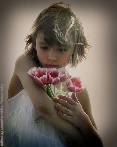
Original image

“Fixed” image #1
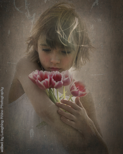
“Fixed” image #2
Steps using PSP Pro Photo X2 Ultimate:
1) Adjusted levels, maintaining that overexposed feeling so as not to darken the face and/or lose detail there. Plus, I really like it in this image.
2) With Nik Color Efex 3.0, I used the warmth/brilliance adjustment at 65% to warm it just a bit, followed by the Foliage effect #2 at 50% to give the tulip stems a little bump.
3) With PSP X2’s Time Machine effect, I went into Cross Process at 10%. Not too much to overwhelm the image, but just enough to draw a bit more color forward.
4) Film and Filters – Glamour at 21%. It’s a soft white glow, which adds to the dreaminess of the image.
5) Slight dodge across the face with a soft brush at 28% opacity.
6) Cropped it down to eliminate extra space.
7) Back in Time Machine – Daguerreotype at 30% on a separate layer, brought opacity of layer down to 70%.
![]() Adjusted RGB levels to 22, 121, 255.
Adjusted RGB levels to 22, 121, 255.
9) Erased a bit of the Dag layer on the face to bring back some brightness.
10) Added a vignette.
11) Added a couple of texture layers, minimizing opacity, and erasing texture over face (second altered image only).
Go check out the other edits and compare with mine. Let me know how you think I did.

:worship:
Comment by Cheri @ Blog This Mom! — 2009/05/15 @ 12:12
I like 1. Very cool…! :thumbs:
Comment by Pam — 2009/05/15 @ 12:21
Welll…….
The original has problems as a photograph that even I can see. But there is a dream-like quality to it I like very much. I don’t know that I would have done anything to it in your place.
But I’m not, so … :-)
Edit #1, the middle photo. I like the stronger colors, which make the tulips ‘pop’ and be the clear center of importance in the frame. Which is as it should be. [Now that I’ve looked at your competitors at the link, a couple seem to be in the mood to make her and the flowers disappear instead of making them look better.]
Alas there is a lock of hair at the crown of her head that now looks detached and added by the SFX Department as an afterthought. And the sunny highlight on the left side of her head looks instead like a place where the color emulsion on an older photo processing method failed or faded.
Edit 2, at the bottom. I always enjoy your ‘nostalgia’ effects of ‘aging’ a photograph. It looks more like an oil painting than even many of your other efforts do. Nostalgia is especially effective here due to this being a child and her holding flowers. What was pretty became haunting in its innocence.
But the hair problems of before remain. It looks artificial instead of enhance natural.
And the nostalgic effect to me is captured in the original anyway. One of your competitors at the link seems to have decided that vomiting purple all over her is perfection. Yeesh. The other two zoom in on her face. Those are excellent portraits. That’s great for her or her family, since they know her. I don’t want to. I want her less focused and that moment of universal innocence captured. I want a poetic image of an emotion, not a biologically correct illustration of a particular person.
Sorry to run on so long.
Comment by Lloyd — 2009/05/15 @ 12:50
I love the second fix – lovely creativity!
Comment by Project Ni Hao — 2009/05/15 @ 12:56
I love that with Fix-It Friday it’s not a competition and that we can use something from each person’s interpretation of the photo to learn from.
With yours, I just have to say that I love the texture you used. So very pretty and it does give the image an oil canvas type of look. I’d love to know where you found that texture.
Thank you so much for playing along!
~Angie
co-founder of I ♥ Faces
Comment by theArthurClan — 2009/05/15 @ 13:49
Thank you, all.
Lloyd, as always, you offer insight so many don’t bother to share. And, like you, that bit of hair sort of bothered me. After applying the texture, not so much. I do think, however, if this were my image that I were printing, I’d either clone that out, or mute it significantly.
Angie, thank you for taking the time to comment. I’ve emailed you a link to the texture pool in case you’re interested in the many, many textures available. Also, please let the donor of the image know how much I enjoyed this particular Fix-it. The girl is just adorable!
For everyone else: Flickriver has a wonderful collection of textures on display.
Comment by DaGoddess — 2009/05/15 @ 16:10
the lock on top doesn’t bother me and i like the second one best
Comment by patti — 2009/05/15 @ 16:49
Very nice edits :).
Comment by Amanda J. — 2009/05/16 @ 05:51
Thanks, Patti and Amanda!
Comment by DaGoddess — 2009/05/17 @ 23:20