Decisions
I’ve been working on something and I’ve created so many versions of it that I’ve lost perspective. This is where you get to play along at home and help out.
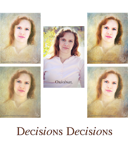
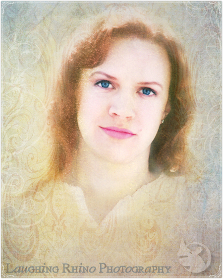
Below the fold is the original image with several edited versions, including one at larger size so you can get a better idea of what it looks like. Based on that, I need to know which image you like best.
Obviously I’m going for a certain look. The original image isn’t going to do what I want it to do without my futzing around. And futz I did. The thing is, I don’t know if softer or bolder or warmer or cooler is the right way I need to go. So, have a look and let me know.
Filed under: Photography ~ Comments (16)
First impression I prefer the lower left.
Comment by Stu — 2009/09/22 @ 06:12
1 for the lower left it is
Comment by DaGoddess — 2009/09/22 @ 06:16
Well, I hesitate to weigh in, because you know how I did on the color test, but…
I agree that the tone of the lower left is better. Warmer? But I also like the boldness of the top right.
It’s really cool! Amazing what can be done with editing.
Comment by De — 2009/09/22 @ 07:17
heh, I’m now leaning toward either the top left and top right. Can’t decide to save my life.
Comment by DaGoddess — 2009/09/22 @ 07:23
Top Left. :pirate:
Comment by Retired Navy CPO — 2009/09/22 @ 07:49
My vote is for bottom left, definitely. Face is too whited-out in the upper left, lips are too strong on upper right and the face overall is too harsh. The lower right is ok (although LL is still better), but both it and the upper right have that darker shadowed stuff along the bottom going which make it look like you’re trying to push her boobs up to her chin.
My 2¢…
Comment by Jan — 2009/09/22 @ 08:53
Hell, I can’t tell… I like ’em all. :nana:
Comment by Pam — 2009/09/22 @ 10:15
I like both the ones on the left better…probably lean toward the upper left.
Comment by Mrs. Who — 2009/09/22 @ 19:26
Lower left or I’ll get ya with me pirate sabre! :pirate:
Comment by JihadGene — 2009/09/22 @ 21:54
Upper right but they are no longer photos. The original image isn’t bad at all; could just add a blur layer of original. …
Comment by Temple Stark — 2009/09/23 @ 01:41
ooh, good idea, T!
Comment by DaGoddess — 2009/09/23 @ 01:54
I prefer the one that you selected at the very bottom of the post AND the one on the top right, perhaps becuase the face DOES stand out and her eyes, which are very beautiful in real life, seem to jump out at the viewer.
Comment by RJ — 2009/09/23 @ 07:53
Of course, the original photo is also lovely…but, perhaps I am biased? LOL
Comment by RJ — 2009/09/23 @ 07:54
Biased? Nah. Okay, maybe a little. But that’s okay. I am, too. lol
Comment by DaGoddess — 2009/09/23 @ 16:58
FWIW I too prefer the lower left.
However please bear in mind we are all looking at these on many different monitors – most or even none of which have been calibrated. :biggrin:
Comment by Teresa — 2009/09/23 @ 17:49
Teresa, Did you go play with the color IQ test? You may find you’re more calibrated than you thought!
Comment by DaGoddess — 2009/09/23 @ 20:44